
How A Site Audit Helped Disability Bag Brand Feeldom Increase Conversion Rate by 90%
We conducted a site audit for Feeldom, a South Korea-based brand that designs wheelchair-friendly bags and accessories. Over the course of 2 weeks we poured over Shopify analytics, user session recordings, as well as conducted backend and manual UX reviews and competitor reviews. After implementing our suggestions, Feeldom increased their conversion rate by 90% after 30 days post-launch. They also cut their abandoned cart rate in half.

Feeldom brought us in because they knew that their website needed some help, but they had reached the limits of their DIY Shopify skills. As their Chief Designer, Adrianne, said "I'm still trying to get a feel for our Shopify site (2.5 years doing it), and I think there may be features we aren't utilizing."
They needed an expert to come in, evaluate the site and provide a course of action based on their goals.
The Goal
Feeldom's main goal was to improve the user flow and purchasing experience. The Feeldom team said they had a loyal customer base, but many of their customers complained that they couldn't find what they were looking for on the site. They struggled with categorizing their products and providing sensible upsells, since many products could only be used for a subset of disabilities.
The Process
We work with clients to identify one or two main goals for the site audit before we start. For Feeldom, their goal was to make the buying experience easier for customers. The metrics we decided to track were the abandoned cart rate and conversion rate.
Part 1: Data and analytics overview
We like to review Shopify analytics as well as customer and heatmap recordings in order to see what areas we should target in our audit. When looking at Shopify analytics we look for particular areas where there are unusual numbers. For Feeldom their "add to cart" and "reached checkout" numbers were similar but then there was a big drop in "session converted". This told us that something was dissuading customers, or the offer was not strong enough.
We also installed Microsoft Clarity, a heatmap and session recording tool. We let it record on the site for a week before digging into the data.
Part 2: Shopify backend settings and store setup
As a first step of the audit, we did a general sweep of their Shopify settings and store setup to make sure they were using best practices and utilizing all the built-in ecommerce features that Shopify offered. We also looked at their checkout flow, since we identified earlier from their analytics that something was dissuading customers from checking out.
We made the following suggestions in our audit:
- Remove the "pick up in-store" option at checkout. It's possible customers were getting spooked that they saw the brand was based in Korea before they saw shipping options. They could fear a large shipping delay or high cost. But if the customer entered their address and continued the checkout flow they would see that there is free shipping for the continental US.
- Utilize new customer accounts
- Authenticate their domain to prevent emails from going into spam
Part 3: Manual UX review with Microsoft Clarity
Next we conducted a manual UX review, looking for ways to improve the purchasing flow.
A subset of our findings were:
-
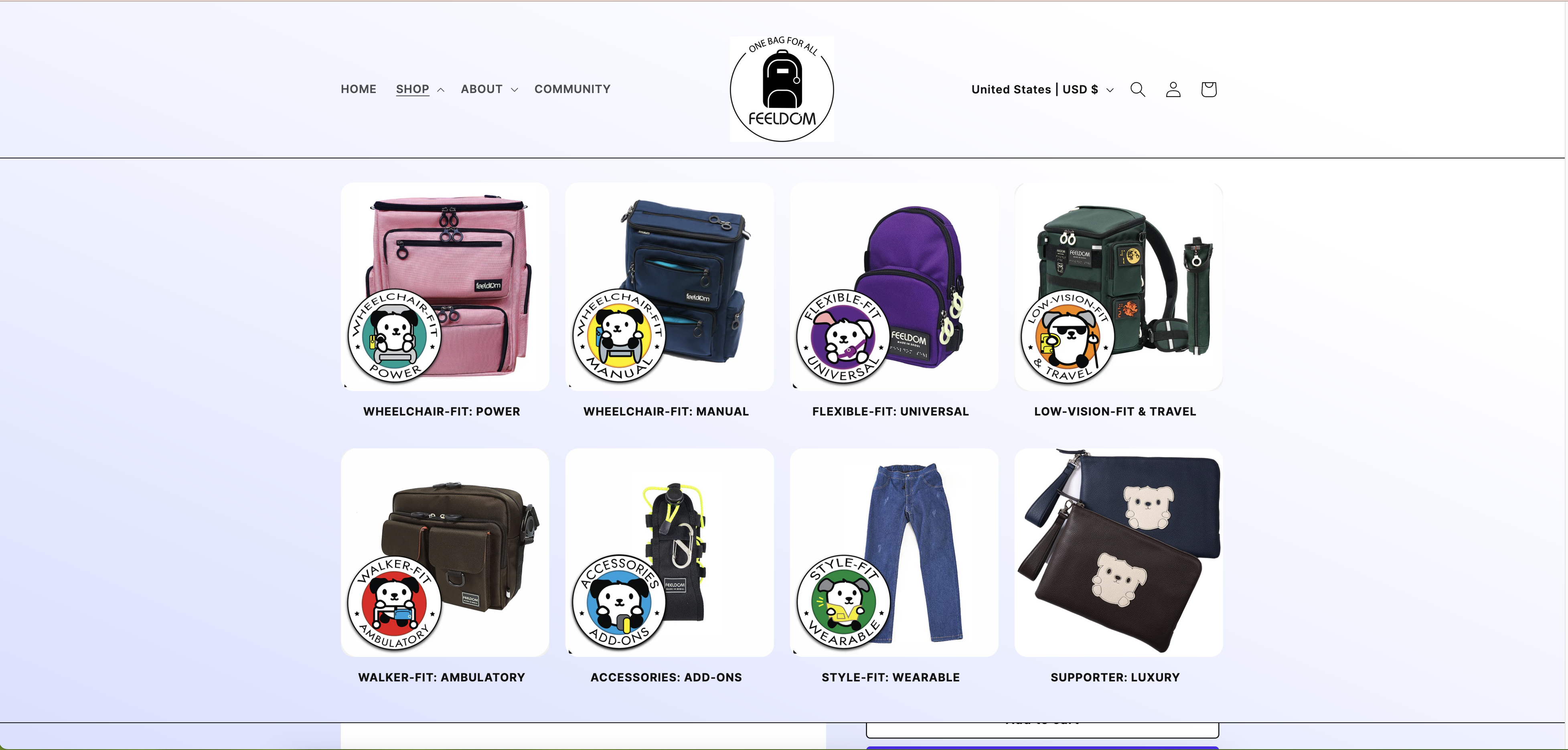
Reorganize the navigation by accessibility need, using each product line's logo for easy scanning
-
Refine filters on the collection page. We recommend organizing filters by accessibility needs (wheelchair, low-vision, etc), color, product line and maybe theme.
-
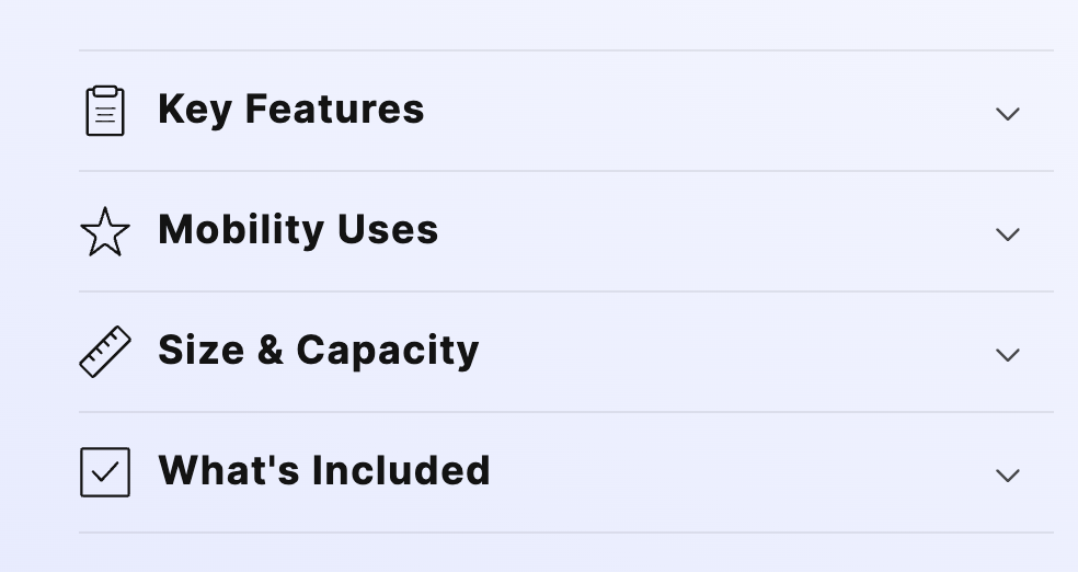
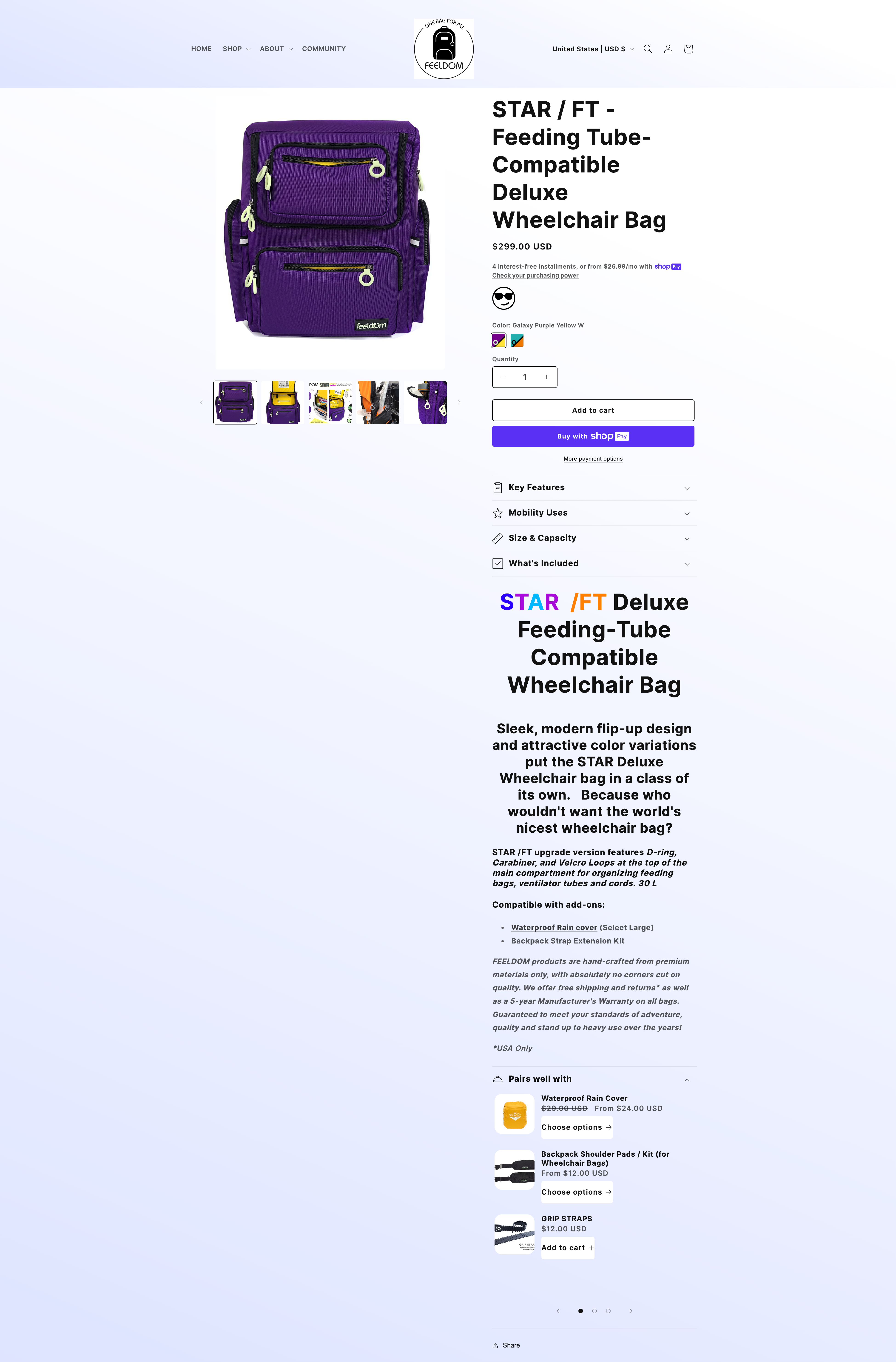
Reorganize the product description into dropdown sections by topic. This is to improve readability and reduce page length.
-
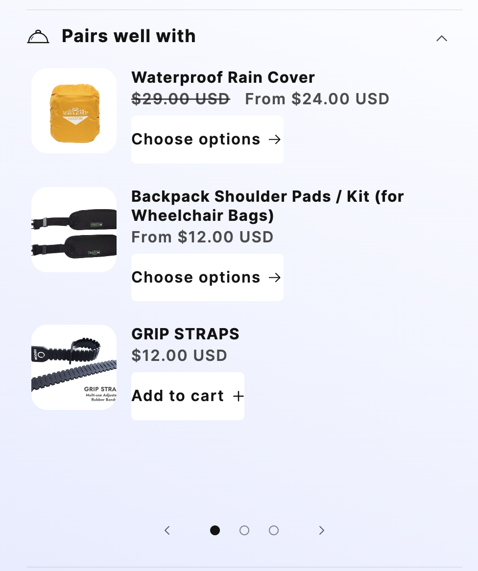
Add relevant add-ons and cross-sells per product to increase the order value.
Afterwards we looked at the Microsoft Clarity recordings over the past week to see if there was anything more to add. The user experience issues were similar to what we had observed already, so our comments were still relevant.
Part 4: Competitor review
Finally we took a look at three of Feeldom's competitors; one Amazon wheelchair bag company, one standalone wheelchair accessory site, and a popular bag brand that had recently released a disabled-friendly bag. We looked at what kinds of UX best practices they shared. We did this at the end in order to confirm or change our recommendations, and see if we could add any further suggestions that are specific to the disabled-friendly accessory market.
Audit document call and next steps
At the end we compiled all of our findings and recommendations in an audit document. We got on a call together with the Feeldom team to go over each point, get their perspective on them and discuss next steps. We decided on the call to follow a two-step approach:
- Upgrade their theme to an Online Store 2.0 version. Feeldom's current theme was a legacy theme offered by Shopify that had been sunsetted. It is recommended since 2022 to use an Online Store 2.0 theme. As a merchant you can have more day-to-day control over your theme and you can more easily edit your theme without developer help. You can also use Shopify's latest improvements in search, filter and product recommendations.
- Divide up the most important tasks between the Feeldom team and our team. Our team performed a subset of the development tasks within our development day service.
.png)
.png)
The End Result
After working with us, Feeldom launched with a modern Shopify theme with better product categorization and suggestions.
The conversion rate on the Feeldom site shot up since publishing the new theme. At our one month check-in the conversion rate was 90% higher than the previous month and also compared to the previous year combined. The abandoned cart rate also cut in half to 32%.
"Jocelyn's suggestions for improvement were presented to us in an easy-to-understand agenda with detailed explanations. She went over each option and process thoroughly in our meeting. This made it easy for us to work together on the final result, and it is amazing!"
— Adrianne Mascho, Chief Designer/Global Marketing at Feeldom