October 7, 2024
Upgrading New Harvest Coffee Roaster’s Ecommerce Design To Improve Sales and Subscriptions
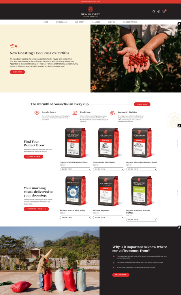
We worked on a site refresh with New Harvest Coffee Roasters, a coffee shop and roastery founded in 2001 and based in Providence, Rhode Island. We overhauled the site with new sales-focused copywriting, trendy design, and modern ecommerce practices. Since their launch, New Harvest increased their conversion rate by 18% and their coffee subscriptions by 40%.
The brief
New Harvest Coffee reached out to us because they wanted to focus on improving their online sales and subscriptions. They had been passively managing the website while focusing on their brick-and-mortar cafe and wholesale operations. Now they were ready to lean into the online store. They felt their website design and UX was falling behind their competitors, as well as not keeping up with customers’ expectations of a modern coffee website.
New Harvest has multiple avenues to their business: D2C roasted coffee, coffee classes for amateurs and professional baristas, wholesale roasting and their Coffee & Spirits cafe. The site needed to highlight all of the touchpoints in their business while not overwhelming the customer.
Fun but professional copywriting and design
We wanted to portray New Harvest as a fun and accessible brand while conveying their professionalism and high standards for coffee quality and education. What makes New Harvest stand out from the crowd is their “Source Direct” program and their dedication to coffee education. New Harvest has been sourcing from the same farms every year for 15+ years. We wanted to convey these characteristics and their core pillars across the site.
Our goal for the design was focused on sales. We wanted to offer an easy buying experience to the user and cross-promote their product line across the site. Many of their customers are older and not very tech savvy. Therefore the design and usability needed to be modern and sharp but also straightforward for customers of all ages.
A seamless buying process
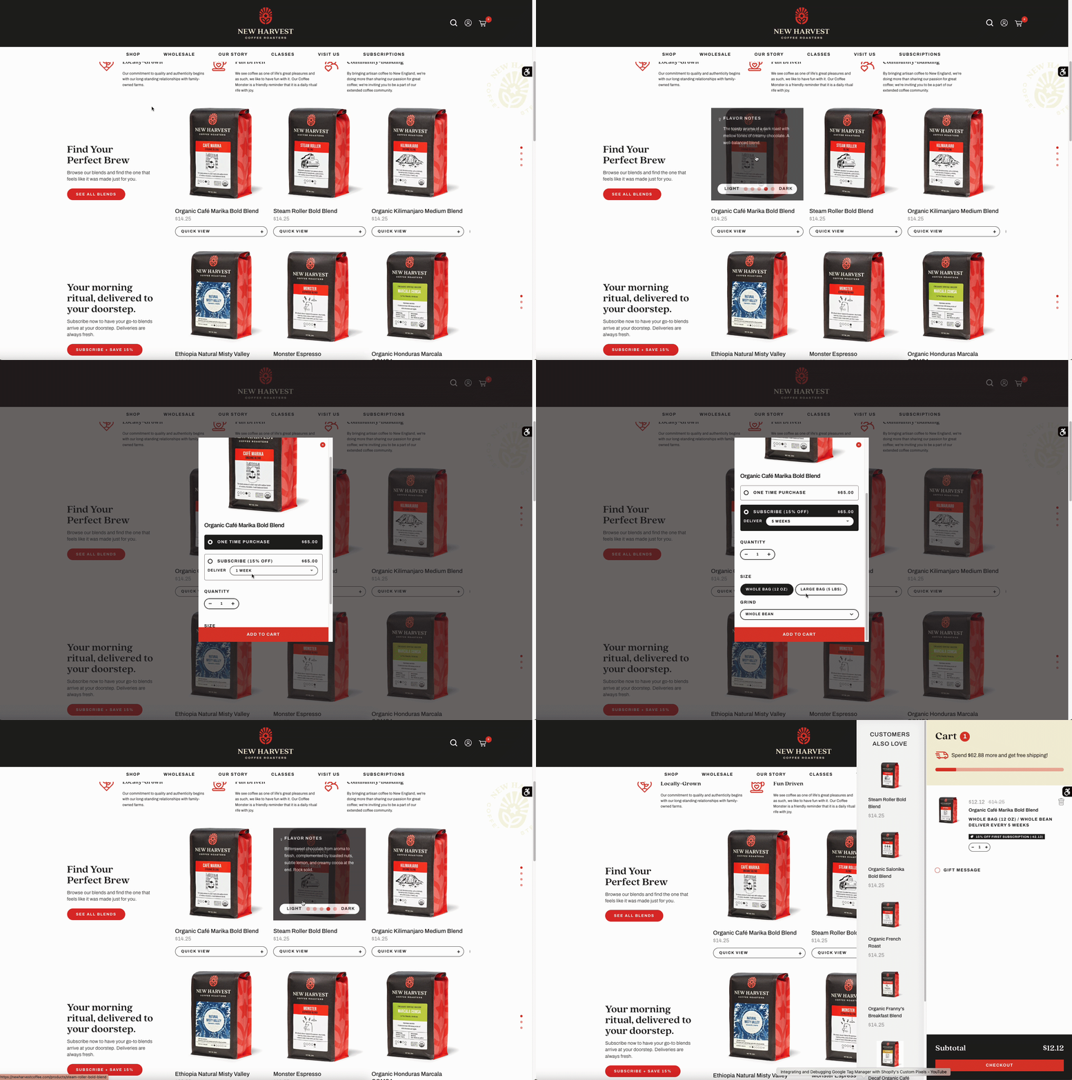
Custom quick add on homepage and collection page
We built a custom quick add popup to easily add new products to the cart without needing to navigate to an individual product page. As you can see in the recording, we also used a 15% discount on first purchase to incentivize subscriptions.
Communicating product information concisely
Customers should understand the difference between coffees at a glance to compare and contrast. New Harvest had all this information in their product descriptions but it was hard to read. We moved easily comparable information like roast level, flavor notes, location, processing and varietals to its own section at the top of the product page. Customers can immediately see a high-level overview of the product without scrolling.
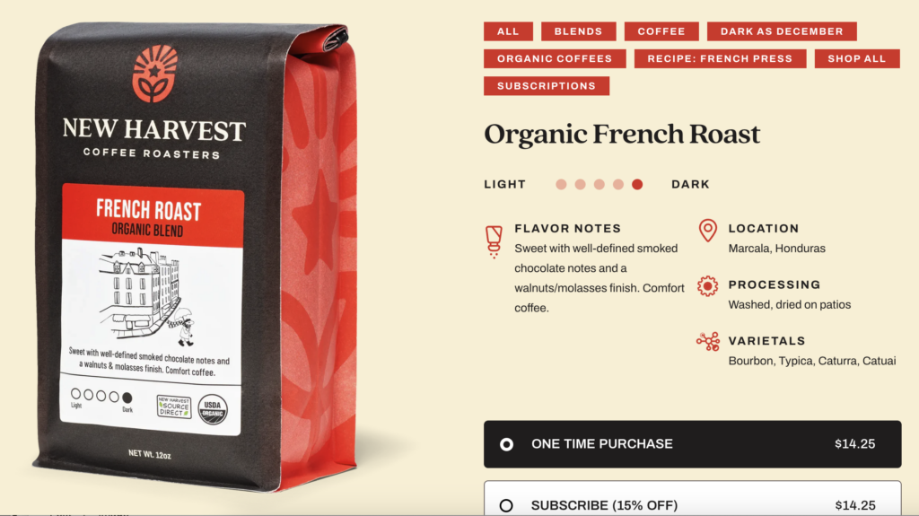
Additionally, on the collection pages we added comparable information on hover like flavor notes and the roast level of each coffee. This made it easy to directly comparing coffees without having to click in and out of product pages.
Curated filters
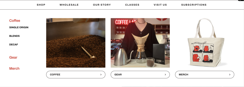
Before working with us, New Harvest divided their products in the menu by coffee type such as single origin, blends and decaf. However this was unintuitive to those who were unfamiliar with speciality coffee terms. We decided to offer two ways to view New Harvest’s catalogue. Coffee aficionados could navigate directly using the sub-categories within the mega menu. The average customer could click on “Coffee” or “Shop” in the menu which would bring them to a high-level collection view. From there they could easily filter down what they were looking for. We selected some easily understandable filter types like product type, roast and coffee type.
Curated product recommendations on the product page
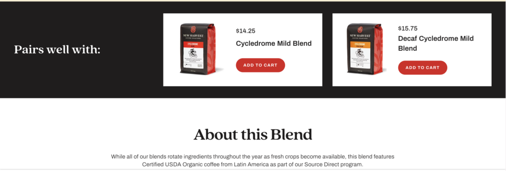
Cross promoting products on the product page was important to keep customers interested. As well as having the default “you may also like” carousel that uses Shopify’s recommendation algorithm, we set up a manual recommendation section so the New Harvest team could handpick the most logical pairings.
Nudging customers to buy
Bring subscriptions to the forefront and provide a better incentive
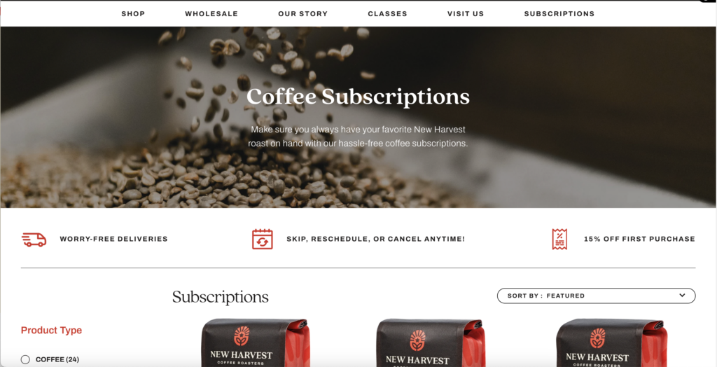
New Harvest wanted to promote their subscriptions more heavily. Most but not all of their products are available for subscription so it was confusing for customers to figure out which ones were eligible. We created a subscription landing page with subscription benefits as well as an FAQ at the bottom to better target those interested customers.
We also worked with the team to add 15% off of customers’ first subscription order to incentivize subscriptions.
Offering sampler bundles to inspire new customers
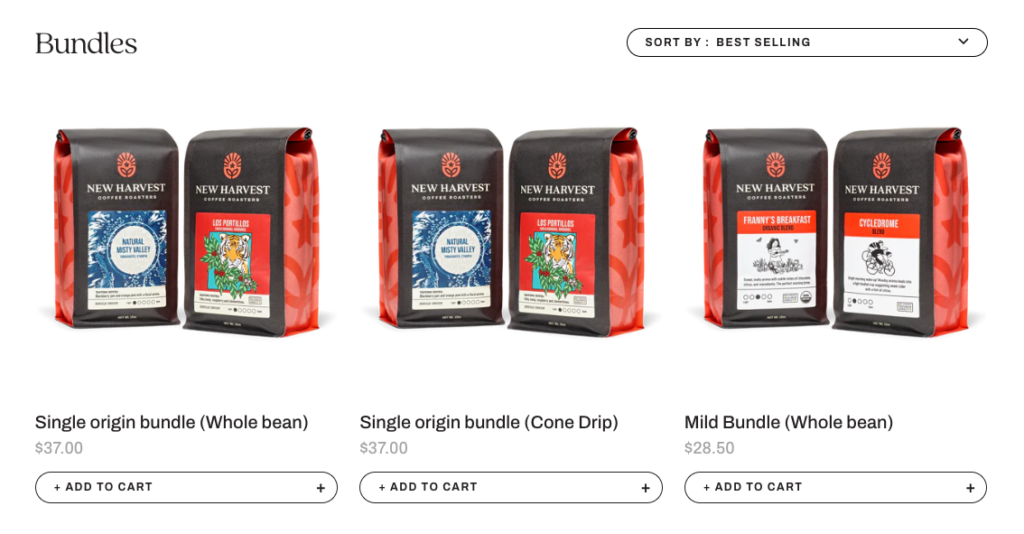
New Harvest had a loyal customer base, with 80+% returning customer rate. We wanted to also create easy access points for new customers to try out New Harvest’s offerings. We worked with the team to create three bundles; a single origin bundle, mild bundle and mug bundle. These bundles would be offered at 10% off compared to buying the products separately to encourage first-time customers.
Simulate social proof with product tags
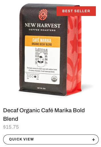
New Harvest didn’t want to add customer reviews, which is normally the way customers know what is popular. We thought it was still important to indicate popularity of products so decided to add custom tags to nudge customers to specific products. We used tags such as “Staff Favorite” and “Best Selling” so we could guide customers to certain products if they were lost.
Keeping things accessible
Web accessibility was also very important to New Harvest along with these ecommerce improvements. After development was done we worked with their accessibility consultant to make sure the website was in tip top shape, accessibility wise.
The end result
After working with us, New Harvest launched with a modern Shopify design that puts them on the map and rivals their competitors.
By leveraging our expertise in ecommerce copywriting, UX design, and Shopify development, we created an online store that encapsulates New Harvest’s fun and accessible brand while allowing for easy touchpoints into each of their product offerings.
Sicne the launch their site, New Harvest has increased their conversion rate by 18% and gotten 40% more coffee subscriptions.
Rik Kleinfeldt, the president and co-founder of New Harvest, said that the redesign now puts them in a good spot to “start looking into marketing avenues such as google tools that we haven’t used in a long time”.
Improve your Shopify UX and web design with Plentiful Commerce
Get in touch with us at Plentiful Commerce to discuss how we can help you achieve your goals faster with updated Shopify website design and development.

