Don't be held back by what your brand was yesterday
Strategic technical partner for $1M+ brands on Shopify. We combine future-forward architecture with proven execution - helping you build the right foundation for sustainable growth.
Things are changing in your business...
You've proven your product market fit and now need to lock in to reach that next level
The challenge
What it means for you
New products or categories
Website design doesn't match and systems needs to change
Expanded regions or languages
More setup per product
Distribution to new channels
Each channel has their own requirements and it's hard to maintain your systems
More people involved (teammates, vendors, partners)
Inefficient systems and mistakes magnify at scale
More site traffic
Higher conversion needed to justify scaling investments
That's where we come in
Who we work with
Established brands that are at the limit of their current setup. You've proven your market fit and now need systems that scale. You're ready to invest in technical infrastructure so you don't waste precious time redoing solutions in 6 months time.
Whether you're the founder charting the path forward or the operator leading the ecommerce team to execute the vision - we're here to build it right.
1 million is just a number but we're using it here to represent a turning point in many businesses. If you have a lower or higher revenue but are at this stage in business, then let's talk.
See our multi-year partnerships
“We are the trendsetters here [in our industry]. We can think big and do whatever we want without following any rubric. I will never stop dreaming up projects that will change the game for our customers or for my team... with the comfort of the knowledge that we have you as a resource. We know that we're not your only client by any means, but sometimes it feels like we are because you provide that level of service.”
Thomas McCurdy, Director of Operations at Farmer Bailey
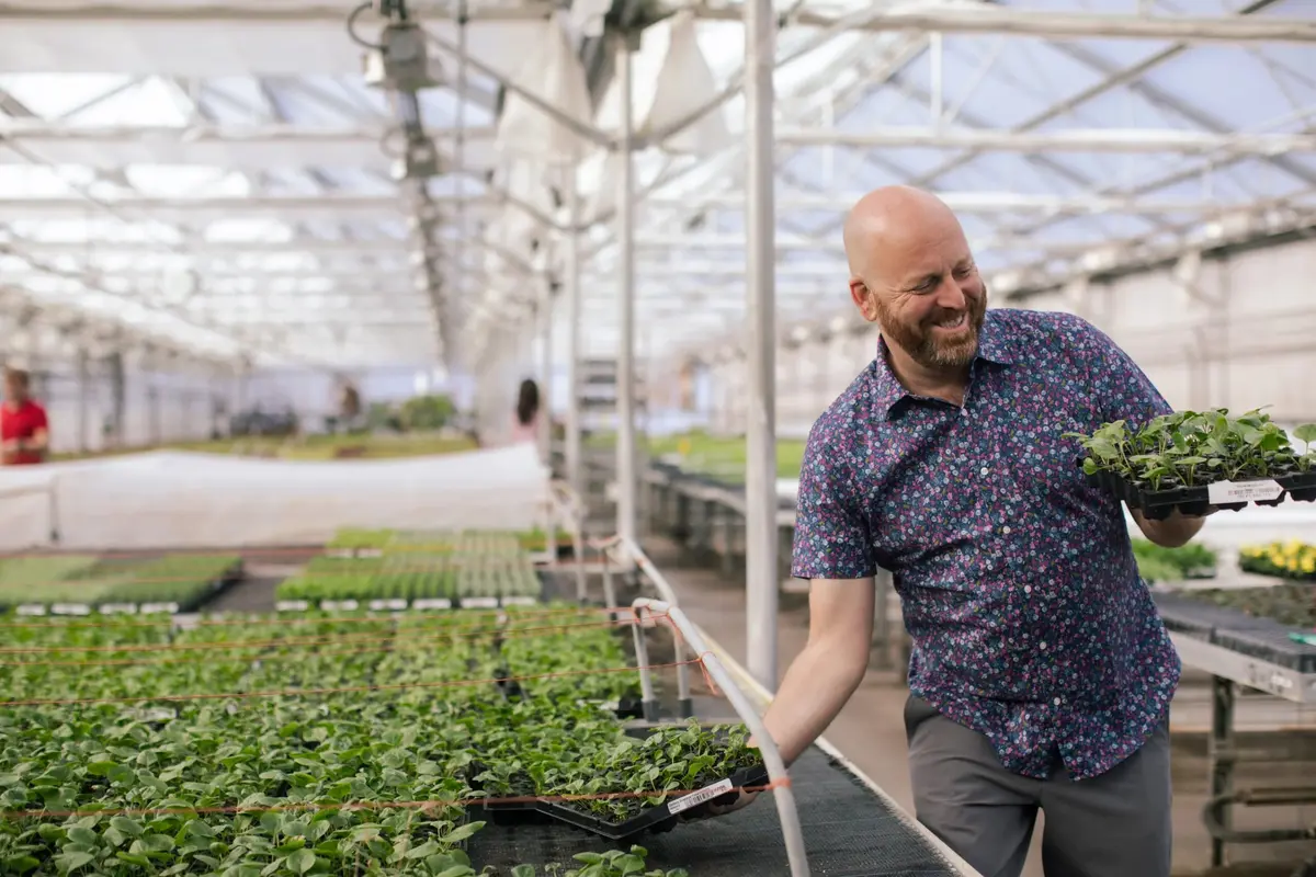
Toynk Toys
Pop Culture & Collectibles · United States

Margot McKinney
Luxury Jewellery · Australia
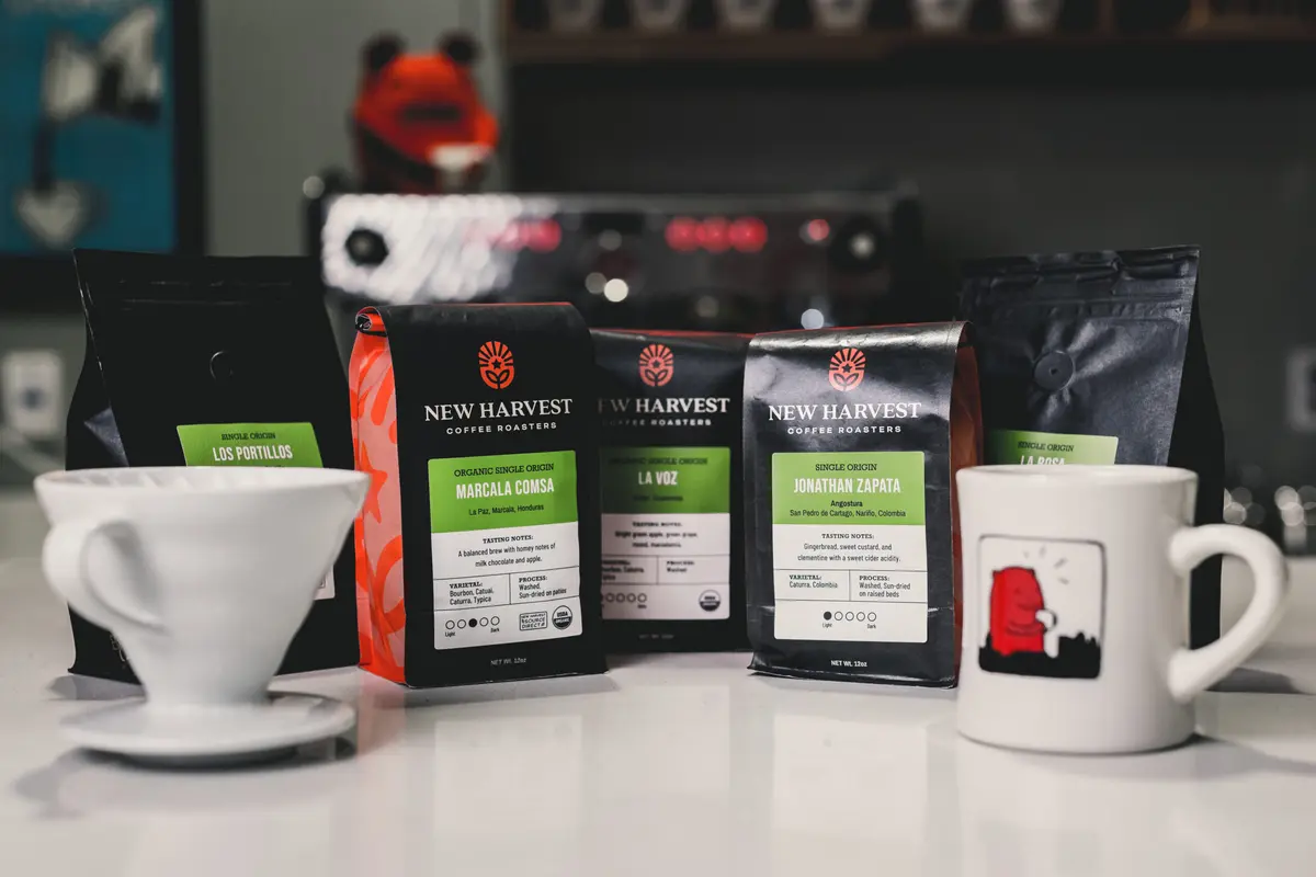
New Harvest Coffee
Specialty Coffee · United States
Our Core Services
Full Store Builds
Problem
Your site isn't converting traffic into revenue. Quick fixes, patched features, and template limitations are holding you back from scaling.
What we do
Design and build custom Shopify stores with strategic UX flows and technical architecture that scales as you grow. We can design with you or implement your existing designs.
Custom Development
Problem
You need specific features, better data organization, or platform upgrades that your current theme can't handle.
What we do
We build:
- Reusable sections to mix and match on landing pages and new pages
- Custom functionality for your specific business needs
- Flexible metafield systems for self-service management
- Platform modernization (Shopify 2.0, loyalty integration, multilingual)
Custom Apps
Problem
Off-the-shelf apps can't handle your specific business logic, unusual integrations, or backend automation needs.
What we do
End-to-end Shopify apps built for limited maintenance and full autonomy for your team:
- Custom checkout validation logic
- Legacy system integrations
- Complex backend workflows
- Solutions no app store product can solve
Full Store Builds
Custom Development
Custom Apps
Problem
Your site isn't converting traffic into revenue. Quick fixes, patched features, and template limitations are holding you back from scaling.
Problem
You need specific features, better data organization, or platform upgrades that your current theme can't handle.
Problem
Off-the-shelf apps can't handle your specific business logic, unusual integrations, or backend automation needs.
What we do
Design and build custom Shopify stores with strategic UX flows and technical architecture that scales as you grow. We can design with you or implement your existing designs.
What we do
We build:
- Reusable sections to mix and match on landing pages and new pages
- Custom functionality for your specific business needs
- Flexible metafield systems for self-service management
- Platform modernization (Shopify 2.0, loyalty integration, multilingual)
What we do
End-to-end Shopify apps built for limited maintenance and full autonomy for your team:
- Custom checkout validation logic
- Legacy system integrations
- Complex backend workflows
- Solutions no app store product can solve
How We Work
Before going through this process, we recommend using our free instant quote tool.
Start with a conversation
In our free 30min consultation we learn the story behind your business, the motivation of this project and what you are hoping to achieve. This is a real and curious conversation, not a sales call.
Receive a Proposal within 2-4 business days
We find the best solution for you, clearly tied to your business goals. We outline cost, timeline, project milestones and clear deliverable breakdowns.
The easy part
We'll send you a contract and first invoice. We'll also include a welcome guide that includes our communication style, points of contact and expected hours of availability, so we can start off on the right foot.
Time to execute
We immediately start to implement the proposal (custom development and apps) or schedule a kickoff call to start discovery (custom builds).
Depending on complexity, we may recommend a paid discovery session. If you move forward, it's credited to your project. Learn more.
About Plentiful Commerce
We're a small, experienced team specializing in Shopify technical architecture. Founded in 2020, we've been the go-to development partner for scaling brands from luxury fashion to specialty retail.

Jocelyn
Founder

Ile
Developer
Jordan
Developer

Ana
Project Manager
Let's Talk Shop
Book your free 30-min consultation to discuss where your business is headed and what infrastructure you'll need to get there.